How To Attract Prospects At Trade Shows by Designing Great Booth Messaging
Published Oct 26, 2022
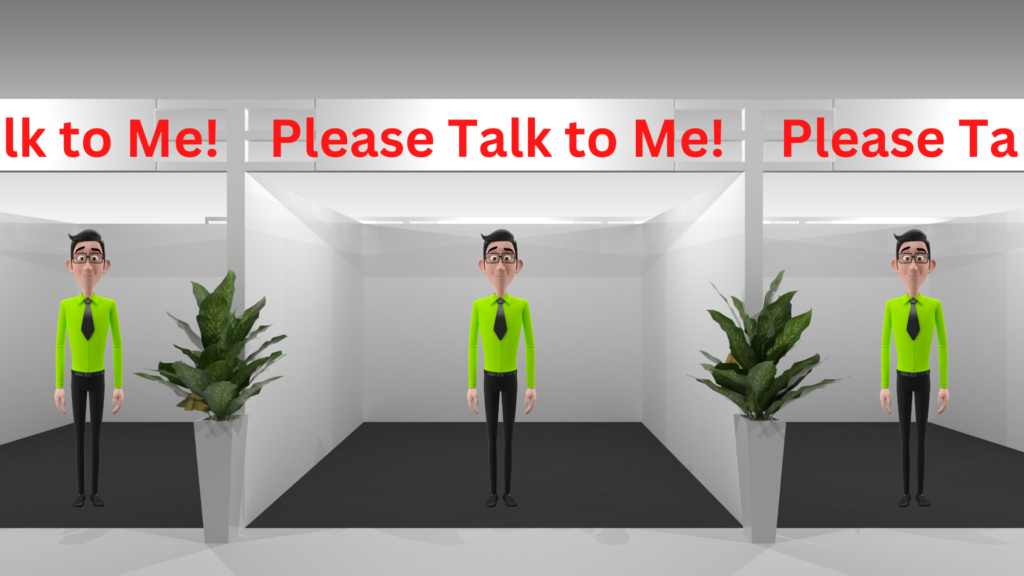
Hooray! Tradeshows are back after being banished during the Covid years.
The excitement and enthusiasm for a live relationship-building environment is stronger than ever.
Maybe you’re just fed up with virtual meetings. Or trying to stay ahead of recessional head winds.
But everyone seems to be diving into the sales mosh-pit of tradeshow events.
Tradeshows of course are very expensive, when you consider the booth rental, travel, entertainment etc. They can easily run $5000, $10,000 or even $50k or $100k for the big ones.
And there’s usually a lot of pressure to show a return from that investment, right?
Unfortunately, in my experience, many companies don’t really do a good job of planning, especially the messaging.
As a veteran of hundreds of tradeshow events big and small, I’ve seen some really good booth setups, and a lot of really bad ones. I recently took in the industrial conveyor belting tradeshow for NIBA (the National Industrial Belting Association) in San Antonio. Although it wasn’t a very large tradeshow, I still used the opportunity to analyze decent booth setups, as well as not-so-great setups. Unfortunately, there weren’t any great displays.
I’m NOT going to talk about the pre-show and post-show activities that need to happen to achieve success… that’s for another article in the future.
Here, I’m going to give you some pointers on how to attract eyeballs, and prospects, to your booth during the show. This article is focused on companies that do NOT have massive brand presence. Which is the majority of companies at trade shows.
And I’m going to show you some real live examples of how to do it right, and how to do it poorly. From the singular perspective of your booth messaging.
Let’s dive in.
You Must Attract Your Prospects
There are two types of show attendees; current leads, prospects or clients that you’ve already started relationships with, and completely cold prospects. I’ll be writing about the latter group. Because you should have dealt with the first group in your pre-show reach-outs.
You have maybe 5 to 10 seconds to attract the interest of people walking the floor. And let’s face it… attendees HATE the prospect of being tackled by pushy show salespeople.
They rarely make eye contact, try to shuffle past quickly, and really just try to see if your company can help them by quickly looking at your messaging.
So your messaging better be persuasive and compel them to do that dreaded thing… engage in conversation with a (gasp) sales person!
Three Parts to the Headline Messaging
Display messaging (the big words on the pull ups and booth walls and backdrops) needs to be like a billboard, or like your homepage on your website.
The headlines and subheaders need to accomplish three main things:
- Tell them who you are.
- Tell them what you do (it should be something the prospect wants or needs)
- Tell them what makes you special. Differentiates you. Makes you better.
Items 1 and 2 are essential to have in your show messaging. Item 3 isn’t essential, but sure makes the whole message more compelling.
Highlight the Benefit, Solve a Problem
Point 2 can be in the form of a promise. Make a big promise about a benefit they will get if they use your company! Of course, it needs to be the truth, and you’ll need to have proof. But hitting something that resonates with your prospect vastly increases the odds they’ll stop and talk.
Give Them Proof
“In your face” proof of claims works well too; awards, testimonials in big print, case studies, leadership claims, and social proof are all good. But whatever you use needs to be quickly and easily digested. Remember, prospects are walking and glancing left and right. While looking at their cell phones.
Come Up with a Differentiator
Start with your list of features, the benefits associated with them, the resulting wonderful condition they produce in your prospects/clients, and most importantly, identify what makes you better than your competition. That is, your unique differentiator. What sets you apart.
Answer the question “so what?” to get from features to benefits. Some features relay a strong benefit. Most of the time, though, the benefits a user gets from a feature need to be spelled out.
And if done right, it creates the feeling of “yeah, I want to get me some of that!” in the prospect. In other words, if dialed in to the needs of your prospect, they feel compelled to have a conversation with you… in your booth!
Let’s illustrate this concept with the following Venn diagram. You should be focusing on where your unique differentiators share space with a pain point/problem/need faced by the business prospect:
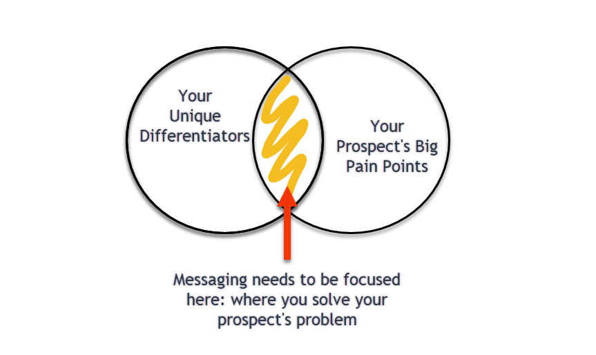
Remember, you’ve got less than 10 seconds to make an impression and get the prospect to stop and ask questions.
6 Real Live Case Studies
Let’s look at a few examples from the NIBA show.
Remember, we’re going to analyze these based on whether they got the Headline messaging on point, not the actual graphic design (although that’s important as well, for gaining attention).
Everyone needs to answer these three questions:
- Who you are
- What do you do (it better solve a problem for the prospect)
- Why should a prospect do business with you (and not your competition)
Case #1: Habasit America
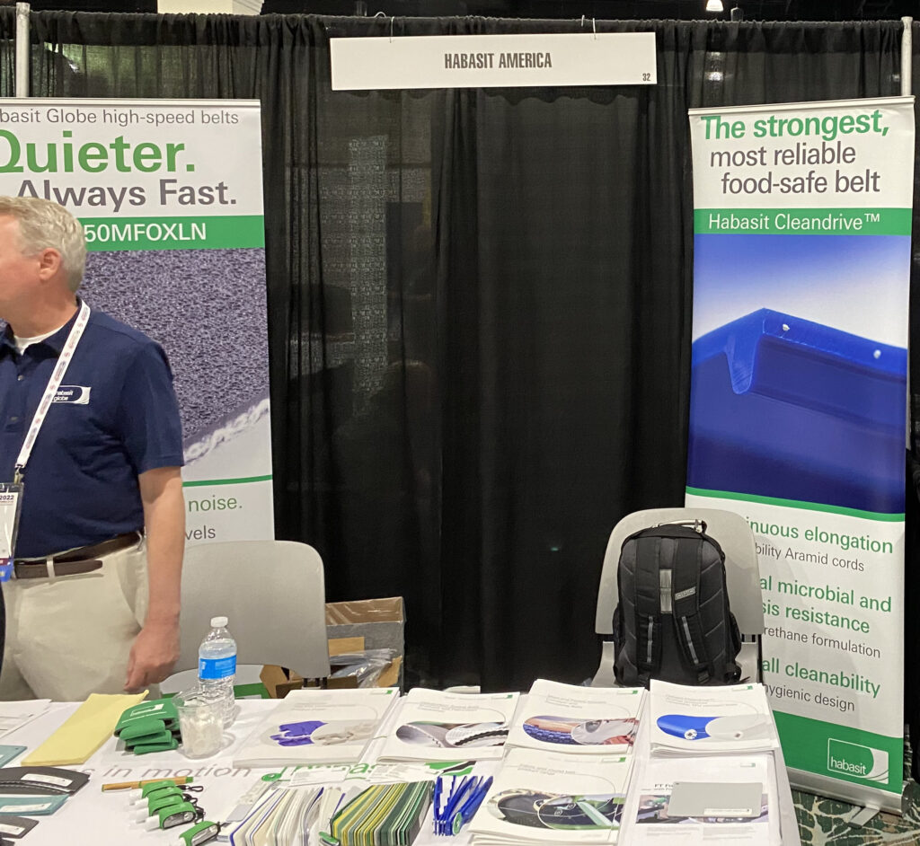
Their name could be bigger, but at least it’s there. More importantly, they state what they do combined with a clear benefit to the prospect. In a way that positions themselves above the competition.
They position themselves as the strongest and most reliable… and identify their target market, the food industry.
Overall mark: B (I took marks off for the small design… hard to see and kind of fades into the background). But at least the messaging was persuasive.
Case #2: Belt Concepts
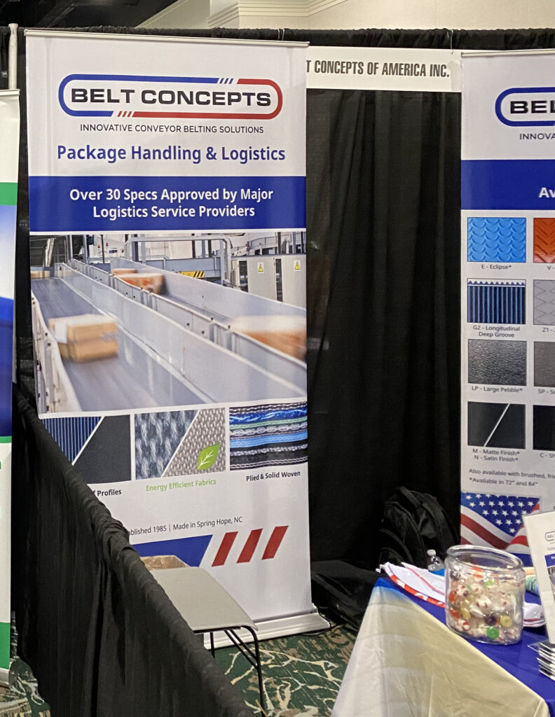
Once again, everything could be bigger. But the messaging is decent.
Who they are: Belt Concepts
What they do: Package Handling & Logistics
Why someone should do business with them: Their products are approved by a lot of the industry players.
Maybe that sets them apart from their competitors.
Regardless, that’s kind of a form of social proof. It might even generate some FOMO (fear of missing out) in prospects.
Overall mark: B+
Now, let’s look at a few examples of booths that were “okay”, but could use some improvement.
Case #3: Arch
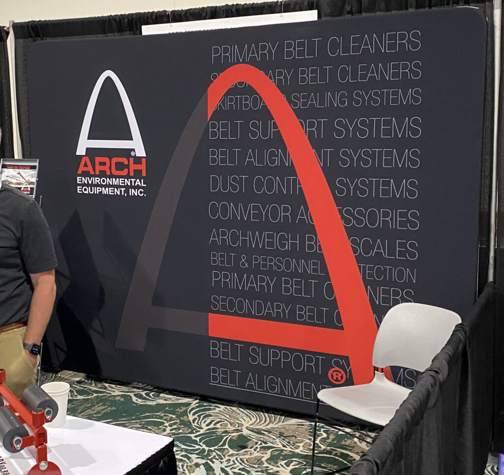
These guys state their name, kind of say what they do (environmental equipment, in teeny letters is part of their name)… but give virtually no compelling reason to talk to them.
What problem do they solve?
What makes them special?
Here’s a suggestion: “Never worry about dust problems again”.
Or “Clean belts run 20% longer and 15% faster”.
Or “127 Facilities rely on our equipment to make their work environment safer”.
Address a prospect need or problem… or state what differentiates you from the rest of the pack. Or both.
Overall grade: C-
Case #4: Uniband
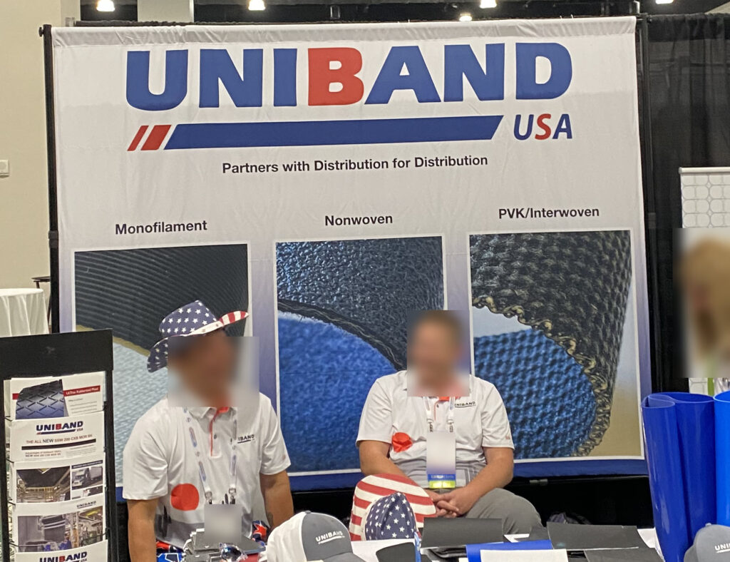
This outfit has their name in a nice big font, which is good.
But for stating what they do… they use tiny letters and a very confusing message.
What does “Partners with distribution for distribution” even mean? I used to own several distribution companies, and even I’m confused.
And what problem or need do they satisfy? Who’s their ideal prospect? They don’t even try to state what makes them different… the “USA” tag implies made in the USA. That’s not really unique anymore.
Let’s assume they are master distributors, and sell to other regional distributors.
How about stating something like “We stock more sku’s, and keep larger inventories, so you can keep your inventory levels lower and never worry about stockouts”.
Or “Our distributor partners enjoy 99.7% order fulfillment rates”.
Or “We handle supply chain headaches, so YOU don’t have to”.
Overall Grade: D
Now let’s look at a few examples of booths that really aren’t very good. It was hard to pick only two for this article…there were a LOT of booths with poor messaging (!)
Case #5: Megadyne
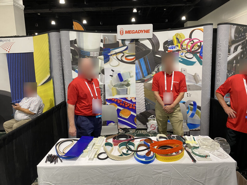
Wow, this really is NOT very good. They state who they are. That’s it.
But in a small font.
Then have a mishmash of product pictures.
They don’t say what they do… they leave it up to the prospect to figure that out. And prospects don’t like figuring things out.
Trade shows are noisy, busy events where everyone and everything is vying for the attention of the attendees. You need to be very clear and direct with your messaging. Most attendees are thinking “Gee I wonder if the lunch today will have tacos?” Or whatever.
And of course, this booth doesn’t address the problems they solve, or the benefits they bring, to their clients. NO reason to stop here… unless you like the pretty colors.
Overall grade: F
Case #6: Nitta
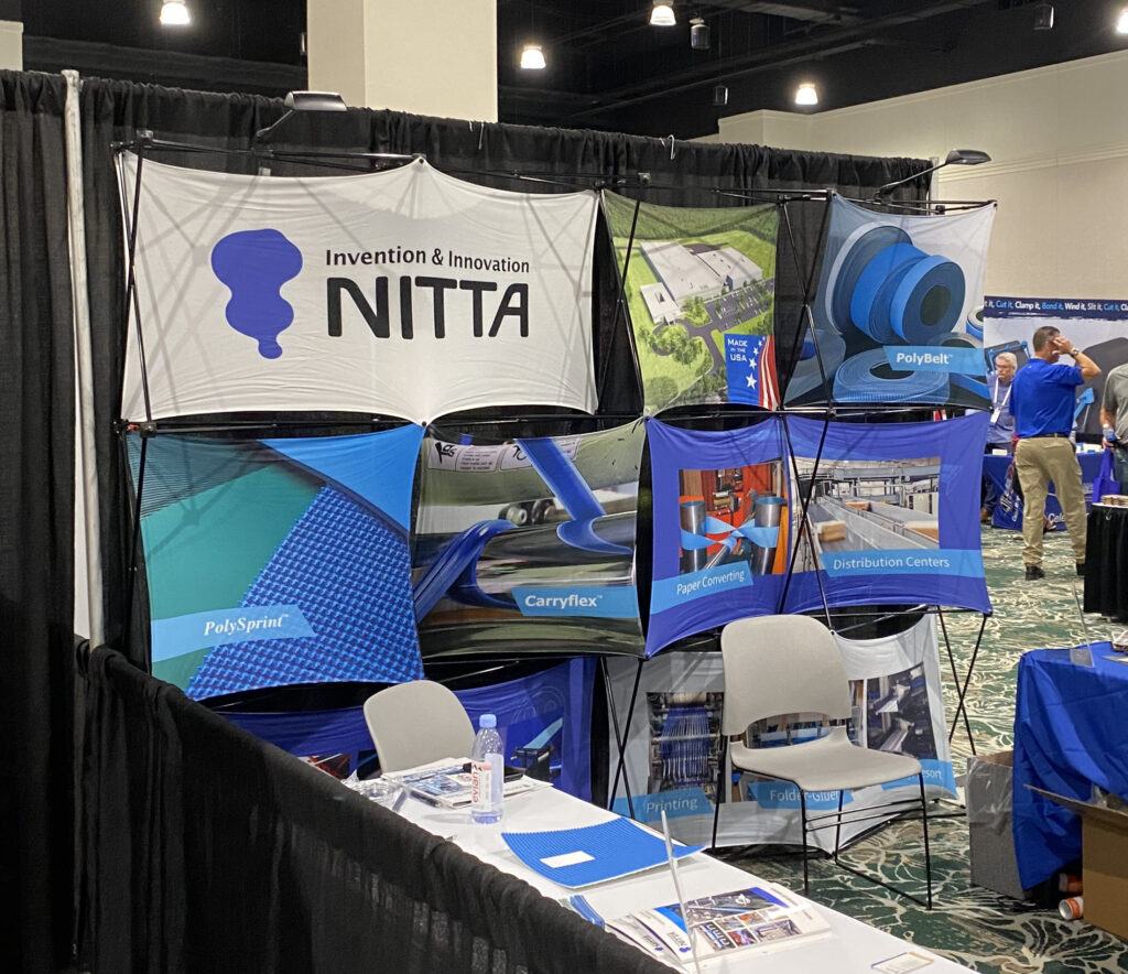
This is the final case in this article. Like the last one, this company only states its name.
The tag line “invention and innovation” contains overused cliché words. Why bother? A prospect’s mind won’t even register the phrase.
Prospects have NO idea what Nitta does, unless they recognize something in one of the weird, small pictures.
And of course, there’s no message about what they do, or the problem they solve. Or what wonderful “state of being” a prospect will enjoy if they engage Nitta’s services. Or products. Or whatever it is they do.
Overall grade: F
Look Through the Eye’s of the Prospect
Remember to put some thought into the headline and sub-headline messaging. Put yourself into the shoes of the prospects you’re trying to attract.
Make sure your messaging is designed to answer the three important questions in less than 10 seconds, at first glance. Who are you, what do you do or provide (and problem you solve), and what makes you special or different.
Do this, and your overall message will do a better job of attracting your prospect’s attention. Remember, it MUST be compelling!
The result?
More prospects stepping up to your little square of carpet and asking “Hey, you guys sound like you can really help me out. Can I find out more?”.
And that is beautiful music to a salesperson’s ears.
Future Articles
There are a lot of considerations in making a successful, high return trade show. Especially pre and post tradeshow activities. I’ll cover off on those issues in future posts.
If you want to receive these practical pointers, consider subscribing to my monthly newsletter, The Working Word, here. You’ll get all kinds of nifty suggestions that will lead to increased sales. The short, focused, actionable advice will be quick to digest… because I know you’re all busy people.
